Project and Team Content
Pushkin State Russian Language Institute in the short description is like a Goethe Institute but for Russian language. It atndartize and prepare lecturers for teaching language and create a test for different language level certificates. Accompanying with the greatest number of methodologists, linguists and developers I have to support design of the old made LMS and create new types of exersises for learning Russian as a foreign language as well as help with open part of the institute. My goal was to be a link between product owner and UI designers and illustrators, did review of designers work and communicate ideas to front-end and back-end developers.
Design and Unification
Communication with team members
I used two approaches for communication: text use cases, which were really appreciated by the product owner and then used as a grant application, and use case diagrams in draw.io (as integrated with plugin to Jira+Atlassian), which have a great success amount of programmers. For illustrators, a list was created of elements that require special graphical work (e.g. list of empty states and entities that need to be shown) and cannot be done by UI-Designer due to time constraints. All design work were created in Sketch because it was cool at that time.
Cards for everything
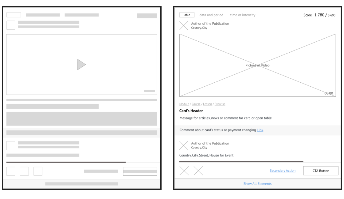
All 29 cards used for user or company information, courses, lessons and tasks in different states (group don’t have free seats, event’s registration is ended and dozens of other cases), online workshops, events and news are based on the 2 layouts: one for the full screen experience and another for the notification feed. Luckily Sketch was released a month before icons and we use it as much as we can.

Navigation
I created a different way of registration and authorization for students, teachers and organization and a navigation concept for each role in the internal part of the site with opportunity to change a role every time. And then all the pages mentioned above, from the start screen to requests for lessons, personal development courses, homework and calendars.
Empty States
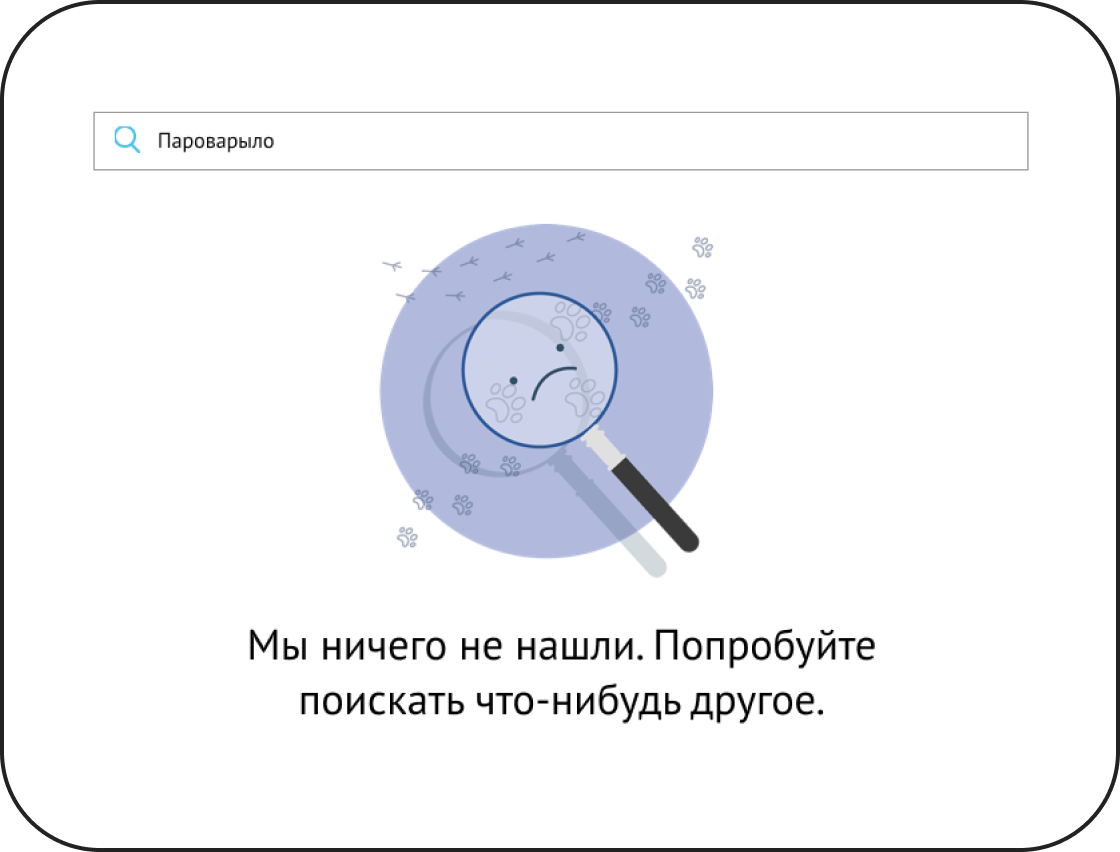
When user just started, there are no courses. If user is looking for something that we cannot find, we show empty space. For each entity (search, course, person) empty state was created. It’s a really fast and small thing, but I like how human it is to say: there is nothing instead there are 0 answers. And I also loved illustrations that were made by colleagues.
